
Look. I’m not going to mince words here.
If 2020 has taught me anything its to get straight to the point and to speak my mind as needed.
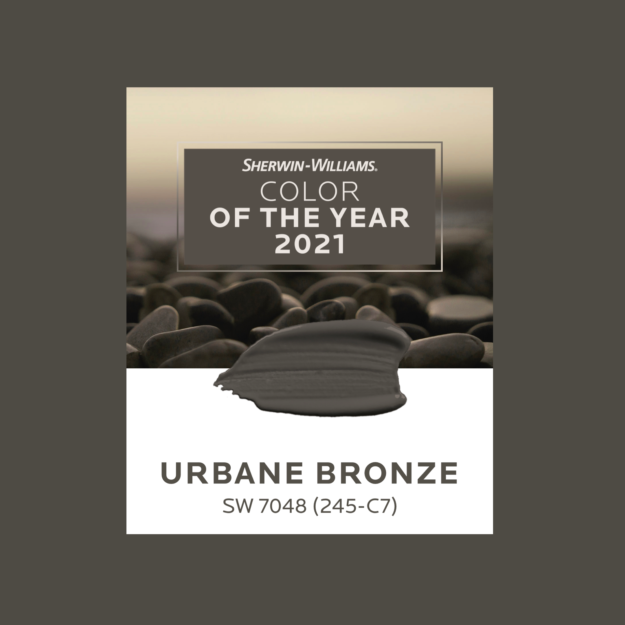
Sherwin Williams Color of the year, Urbane Bronze looks like the results of a much-needed Super Greens juice cleanse.
You know I’m right…
I rarely have negative thing to say about color because well, its COLOR! And color is better than non-color any day. Unless of course we are talking about black. Black is a classic staple and the adage “every room needs a bit of black” is true. Enjoy these black or mostly black rooms.

RlP interiors Vintage inspired dining room 2019

Ralph Lauren showroom High Point NC 2018
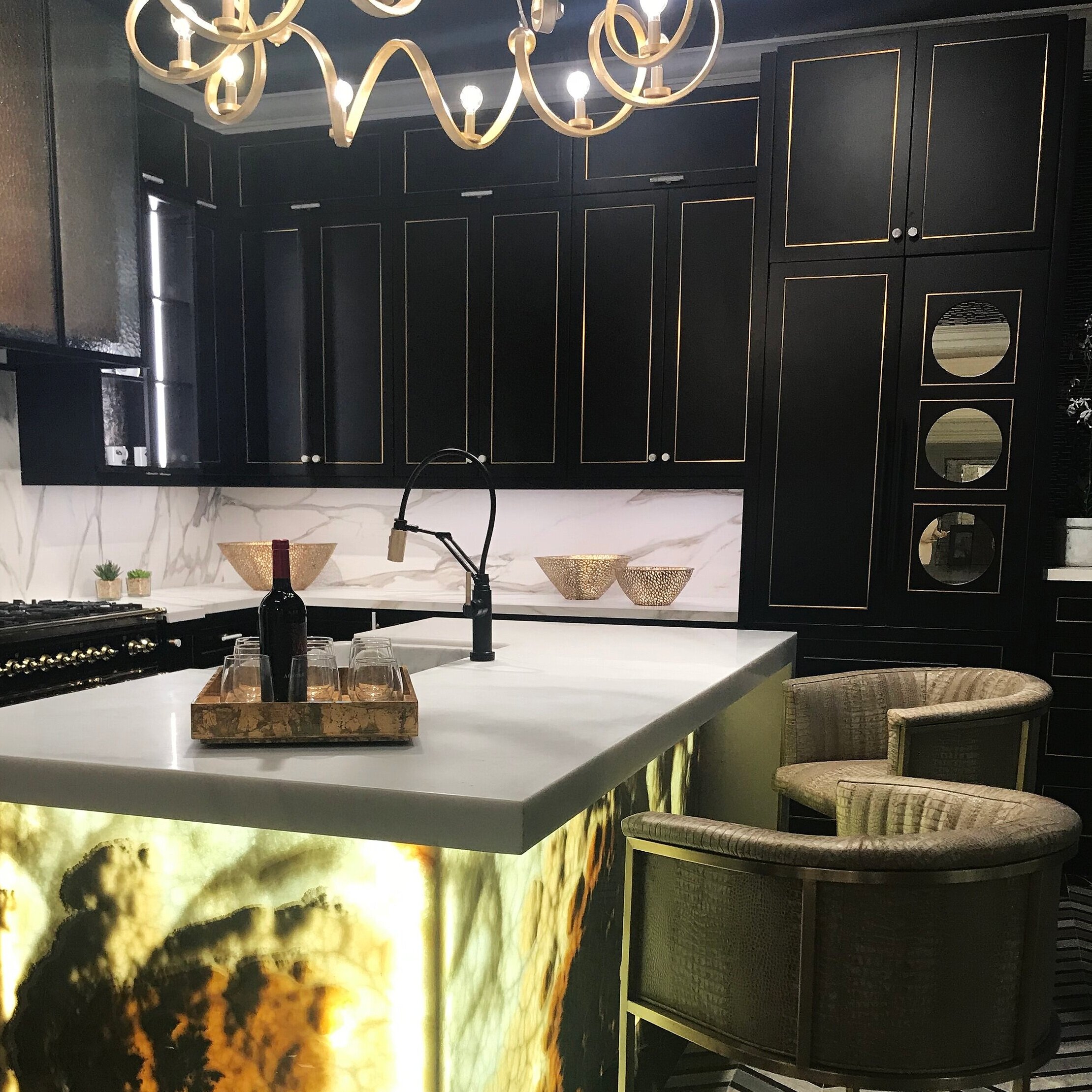
Kitchen showroom Carey Vogel, Las Vegas Market 2018
Anyway…Urbane Bronze is really nice in moderation.
I can see it as a terrific grounding and earthy color used judiciously on door handles, lighting fixtures, exterior shutters. I’m certain it would be an amazing color for wall to wall carpet. And as a leather stretched across a supple sofa arm? That my friend has potential. Just think of the dirt hiding power? You would never know.
What I’m getting at (I think) is that its a good base to build around. But a diet of all Urbane Bronze would be no fun.
My first impression was the green undertone is like a deep khaki gone rogue. Or a black olive left on your Thanksgiving table after your nephew placed it on his sticky little fingers and sucked out all the juice. Totally appropriate for the way 2020 has gone. You catch my drift.
I’ve had a day or two to think and process on this color after it was announced and I can totally see why it was chosen. It is literally already everywhere! I just never really looked for it. It has been around for a long while in the home furnishings arena as seen in the greyed tones of wood and creeping into upholstery as a nice, subtle departure from the previous years of charcoal grey.
So really? It isn’t anything new. But like those regular juice cleanses, I’ve tended to avoid it. Think of it as “the good for you” color. A cleanse from the cooler or more purple undertone grey.
I put together a couple of inspiration concept boards to show you how a bit of color added to Urbane Bronze really adds a bit of punch.
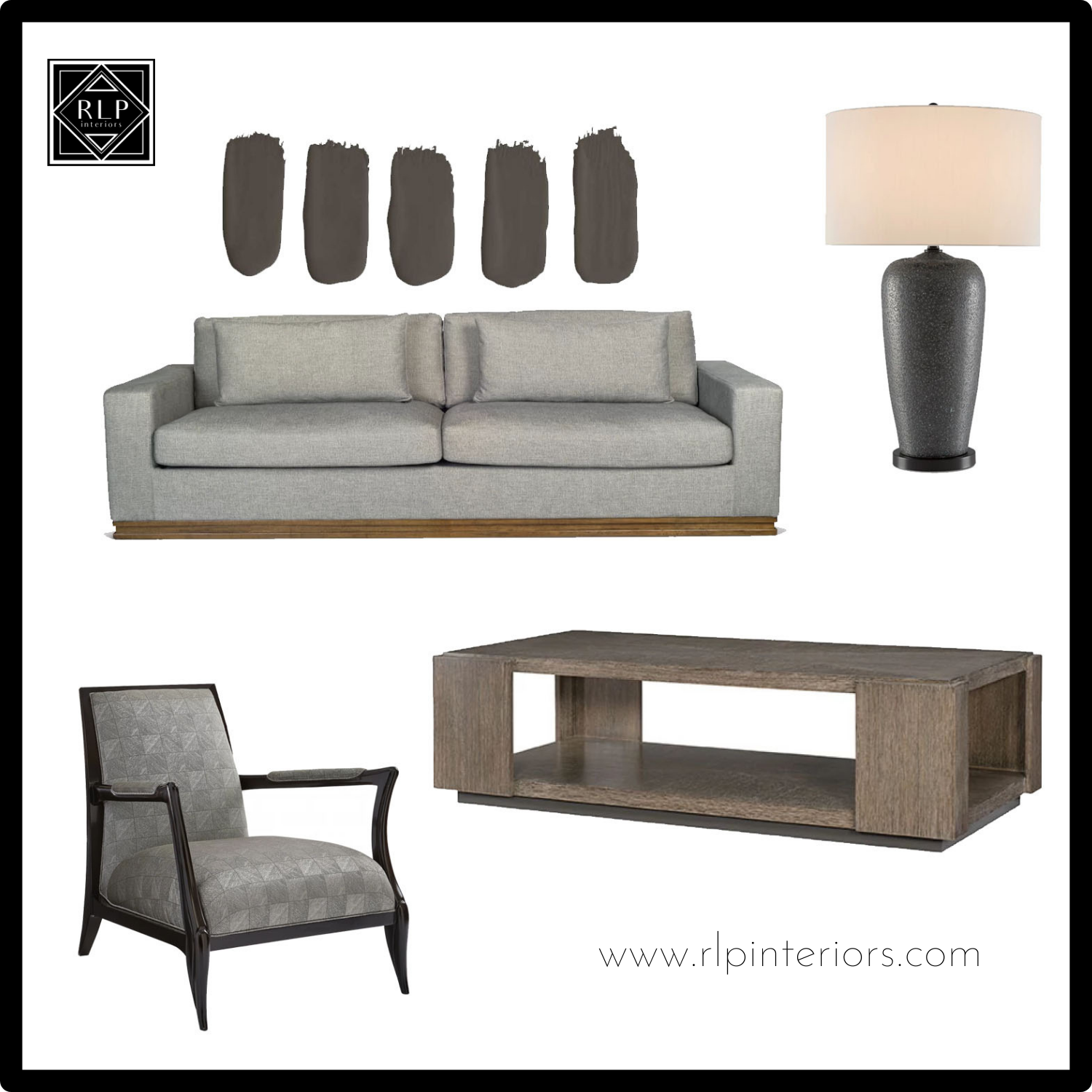
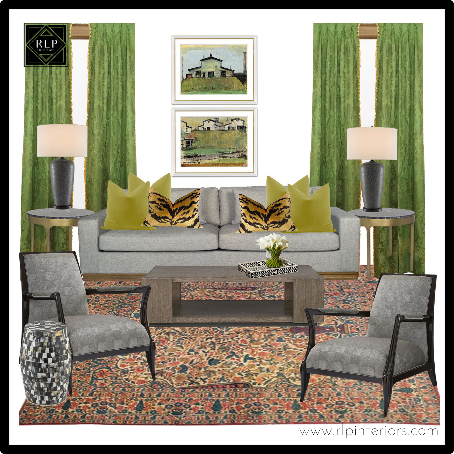
All items shown are available through RLP interiors. Please contact for purchasing info.
On another note. Who has the job to name these colors anyway?
Did adding an “e” to the end of urban make it Urbane mysteriously elevate it from dingy dirty to runway fashion? Why couldn’t they have picked a color more uplifting? According to the Sherwin Williams color panel article they chose the color back in February of 2020. Did they know something we didn’t? Is there a Magic 8 Ball available for the interior design industry to help keep our projects “on trend?’
Maybe while they are at it, they can help predict when my client’s order will miraculously be back in stock? We could be on to something here. I’ll keep you posted.
XOXO
Richelle